A Trio of Light & Bright Bathrooms
Bathrooms are essential in every home. Practical use of space, proper illumination, and well-appointed fixtures and finishes turn individual elements into classic elegance. Unable to be expanded, the home’s three “builder grade” bathrooms were in desperate need of updating. The homeowner desired enduring finishes that evoked tranquility and created an illusion of space. We listened.
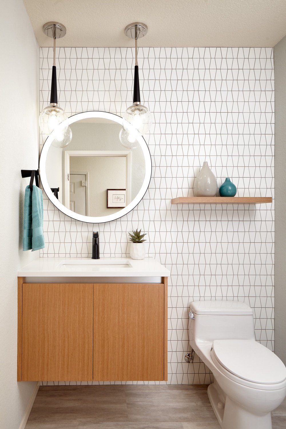
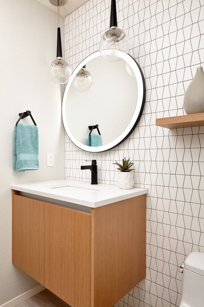
Dual hanging pendants paired coupled with an edge-lit mirror improved the lighting both functionally and aesthetically.
The wall-hung vanity extends the eye to give the illusion of more floor space.
1. Function and Aesthetics
Dual hanging pendants paired coupled with an edge-lit mirror improved the lighting both functionally and aesthetically.
2. The Illusion of Space
The wall-hung vanity extends the eye to give the illusion of more floor space.
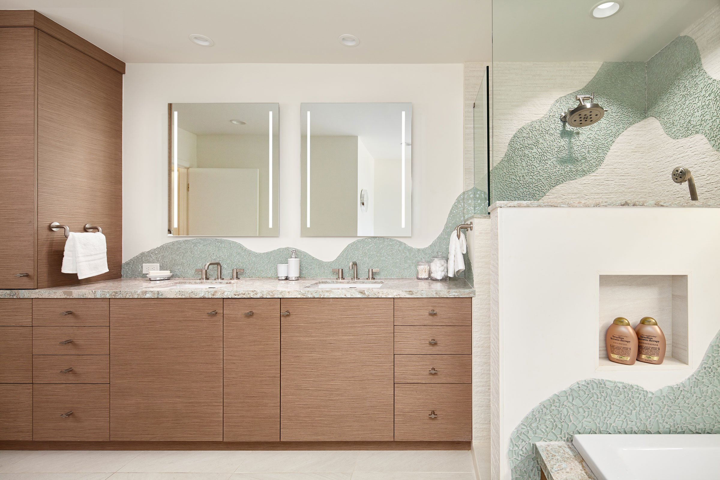
Clean lines and a neutral palette elevate the main bath, bringing it into the 21st century.
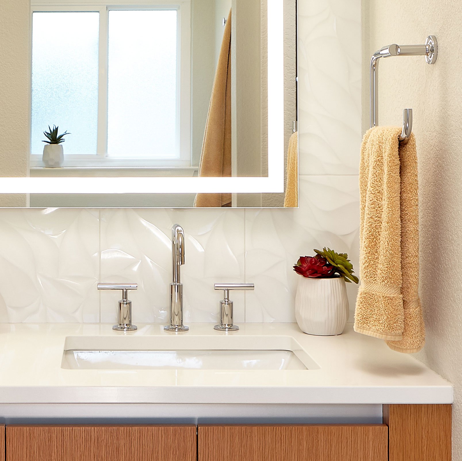
An organic “leaf-like” glossy backsplash spans the height of the wall, complemented by the white counter and satin nickel fixtures.
1. An Elevated Palette
Clean lines and a neutral palette elevate the main bath, bringing it into the 21st century.
2. Organic Backsplash
An organic “leaf-like” glossy backsplash spans the height of the wall, complemented by the white counter and satin nickel fixtures.

The main bath’s leafy, textural shower tile flows into the niche accented by brushed nickel trim and patterned shelf.

Continued in the tub/shower, the textural white tile brightens the space while adding visual interest. The clear glass enclosure with modern door hardware retains the desired spaciousness.

Multi-tiered pull-out drawers in the vanity add much-needed storage.
1. Textural Tile

The main bath’s leafy, textural shower tile flows into the niche accented by brushed nickel trim and patterned shelf.
2. A Modern Tub/Shower Enclosure

Continued in the tub/shower, the textural white tile brightens the space while adding visual interest. The clear glass enclosure with modern door hardware retains the desired spaciousness.
3. Vanity Storage

Multi-tiered pull-out drawers in the vanity add much-needed storage.
MAIN BATH — The two separate areas of the main bath become unified by eliminating the toilet/shower room door and coordinating the tile and flooring, making the main bath feel much more spacious.
Light & Bright
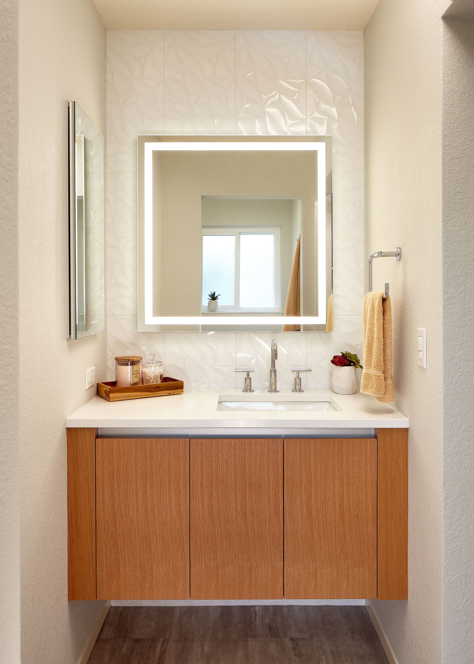
The crisp neutral palette, bright white tile, and LED edge-lit mirrors reflect light, illuminating each space.
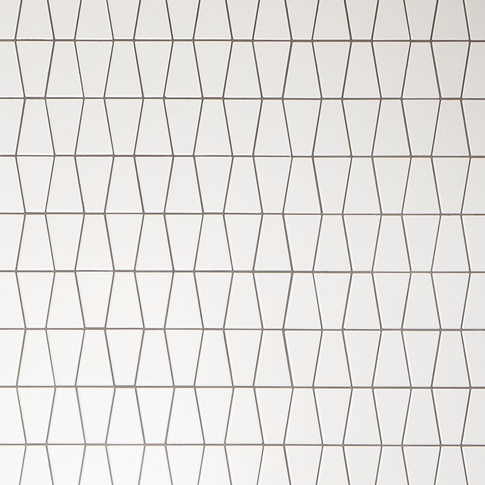
POWDER ROOM — The full-height tiled feature wall in the powder room adds visual interest using pattern and contrasting grout color and helps create height in this small space. The pop of black in the fixtures and pendant details energizes the neutral palette.
Illusion of Space
Full-height tiled feature walls, wall-hung vanities, and clear glass shower enclosures create a spacious feel.
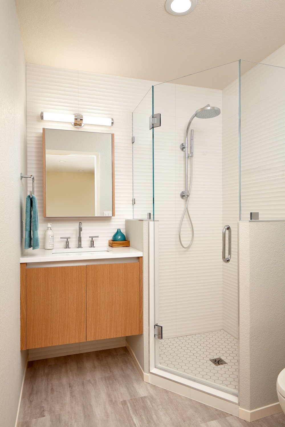
HALL BATH — Unable to increase square footage, adding pony walls to the shower stall creates ‘zones’ — vanity, shower, and toilet area — giving this small space a more robust profile.
Pony walls create separate ‘zones’ in this small hall bath.
A coordinating medicine cabinet provides much-needed storage. An LED light bar offers illumination for the user and highlights the undulating pattern of the wall tile.
1. Storage and Illumination
A coordinating medicine cabinet provides much-needed storage. An LED light bar offers illumination for the user and highlights the undulating pattern of the wall tile.
2. Dividing a Small Space
Pony walls create separate ‘zones’ in this small hall bath.
Talk with a Designer
Whether you have an idea for your home improvement project or you’re not sure where to start, we’re here for you. Schedule a conversation with a designer today.
Interested in seeing more projects?
Take a look at the case studies from our “We Listened” series, showcasing our NARI META award-winning projects.

