Outlet Technology
/in Bathroom, Kitchen, RemodelingEarlier this year, Harrell Design + Build Designer Genie Nowicki, spent three days at the annual Kitchen & Bath Industry Show (KBIS) where she was immersed with the latest industry products, trends, and technologies. Although not as sexy as steam showers, spa bathtubs, and the latest fixtures, electrical outlet technology was prevalent at KBIS.
According to Genie, “Kitchens and bathrooms have considerable code requirements. These are spaces in which numerous appliances are used around water, so there are strict guidelines around the placement and type of outlets used. At KBIS, there were some really exciting solutions to make unsightly outlets more visually pleasing, or unique ways to hide them completely.”
Outlet Technology
With more and more devices requiring USB ports for charging, electrical outlets are finally incorporating this technology and docking stations are being integrated into kitchens and baths.
Smart WiFi plugs are remote control devices, enabling automation to actively manage any appliance, light, or device via an app or using a smart home assistant. Affordable and easy to install, these smart plugs allow you to control or schedule lights and temperature, pre-heat hair styling devices with the touch of a button, regulate your kid’s access to gaming consoles and television, and monitor your home’s energy efficiency.
For years, outlet trim plates have been available in a variety of colors, designs, and finishes but the outlets themselves hadn’t followed suit. Finally, outlets are being designed in a number of metallic finishes to create a seamless, cohesive appearance.
Creative Outlet Placement in the Kitchen
GFCI outlets are required to be placed every four feet in a kitchen, and within two feet or less of the edge of a sink or cooking surface. There are multitudes of ways to make outlets less conspicuous, maintaining function without compromising the aesthetics of your space.
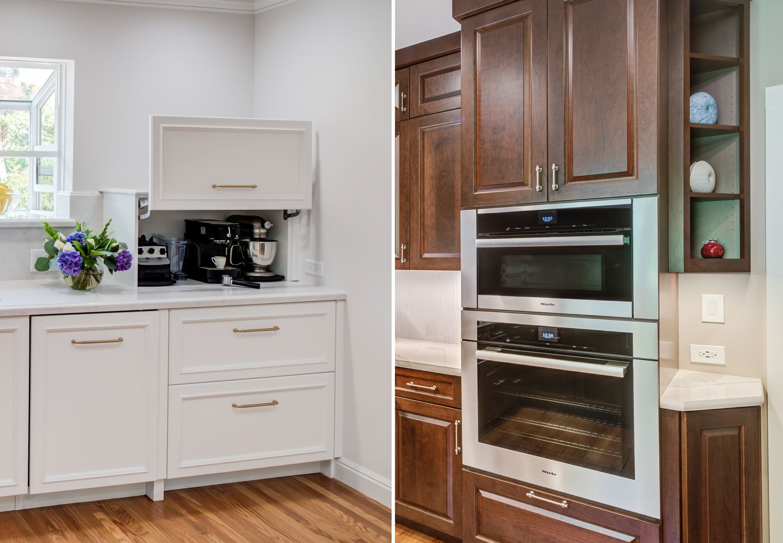
- Under cabinet outlets: The outlet or outlet strip is hidden from view but may have “dangling” appliance cords.
- Pop-up outlets: Tucked into the surface of a countertop, these low-profile outlets are made accessible by simply pushing on the them to have them ‘pop’ above the counter or pushing them down to hide them away. These may not be accepted by all building departments.
- Outlet post: Nestled between cabinets, a post is a great way to incorporate outlets.
- Hinged cabinet facade: Hiding outlets behind a hinged drawer façade allows accessibility when needed but is disguised when not in use.
- Recessed below counter: An outlet strip can be hidden underneath a deep countertop edge, peninsula, or island overhang for easy access without compromising design.
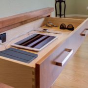
- Inside drawers/cabinets: A great place to install a docking station for tablets, phones, and others devices.
Creative Outlet Placement in the Bathroom
Just as in kitchens, our bathrooms must have GFCI outlets and have equally strict requirements on placement. We typically have a number of personal grooming devices that can crowd our countertops, creating a tangle of cords and a battle over outlet access. This can be resolved with creative and functional outlet placement.
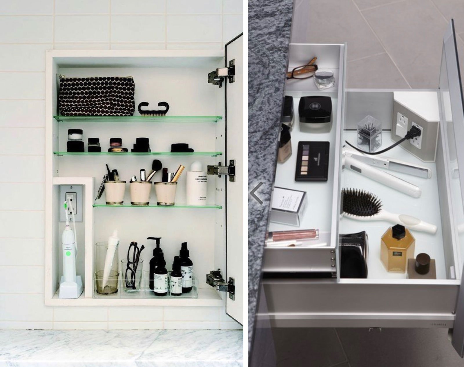
- Medicine cabinets with built-in outlets: great for storing and charging electric razors and toothbrushes.
- Inside cabinets: A great way to get outlets off walls is to place them inside cabinets. USB outlets allows for charging of phones, wireless speakers, and tablets.
- Underneath counters: An ideal blend of accessibility and functionality.
- Inside drawers: Outlets at the back of a drawer is ideal for plugging in hair styling or personal grooming devices.
- Pop-up outlets: These low-profile outlets work well in bathrooms and can be set into the countertop.
“It’s always exciting to offer clients inventive new ways in which to integrate outlets in bathrooms and kitchens that both maximize and personalize the function and beauty of the space. Plus, the evolving technology that allows homeowners to control appliances at the touch of a button is very desirable,” shares Genie.
Are you dreaming of updating your kitchen or bath? Schedule a complementary meeting today and allow the design team at Harrell Design + Build to help you discover what’s possible.
Genie Nowicki, senior designer, holds numerous certifications in design, and is a renowned authority of Universal Design, and the recipient of multiple awards. Genie joined the Harrell Design + Build team after years of running her own successful design business. Beginning her career in the world of income tax planning, she made a career leap in 1990 to the equally “detail and code-filled world” of kitchen and bath design. Genie obtained her Certification in Professional Kitchen and Bath Design in 1992 and achieved her Certified Kitchen Designer (CID) and Certified Bath Designer (CBD) status in 1996. After passing another rigorous examination, she became a Certified Interior Designer (CID) in the State of California in 2002 and a Certified Aging in Place Specialist (CAPS) in 2006. Her experience has included residential interior design, kitchen and bath design, barrier free/Universal Design, lighting design, and participation in numerous showcase houses in the Bay area, as well as several commercial projects. Genie prides herself on listening to her clients and providing timeless design work that is appropriate to her clients, their lifestyles, and their homes. Her excellence in design has been recognized with awards, projects published in local and national magazines, and a Sunset design book, and an article she wrote was featured in the Fine Homebuilding Kitchen and Bath Annual Issue.
Add Some Fun To Your Next Remodeling Project
/in Remodeling, Kitchen, BathroomRemodeling a kitchen or bathroom can be a serious undertaking, but it can also be a great opportunity to add a touch of playfulness to your home. Whether you are remodeling a powder room, a master bath, or a kitchen, the Harrell Design + Build design team excels at creating modern residential designs while also developing special spaces that reflect the personality and spirit of the homeowners.
Americans are staying in their homes longer than ever before, opting to renovate or remodel rather than move to a larger residence. Families in the 1950’s typically moved approximately every five years. Since 2013, most people tend to stay in their homes an average of nine years compared the year 2000 when they moved every seven years. Many Bay Area and Silicon Valley residents are following this trend and as a result, personalized remodeling designs that are unique and individual are becoming more popular.
Gloria Carlson, a senior designer at Harrell-Remodeling, loves to create fun and creative designs that reveal her clients’ unique personalities and passions.
“The number one thing I do when I have a specialized design project is to listen. I want to understand what they are looking to achieve, both functionally and aesthetically, so that I can help to realize their dreams,” said Gloria.
Here are three examples of Harrell Design + Build clients who wanted to express their individuality in their kitchens and bathrooms, and how Gloria’s exceptional talent for creating enjoyable and useful designs were incorporated in these projects.
Creating Enjoyment Through Better Organization
Recently, a couple with whom Gloria had known previously came to Harrell Design + Build wanting to create a larger kitchen. Having been entertained by this family in the past, Gloria already understood the owner’s kitchen “rhythm” and family flow. She recognized that the client cooked in designated areas throughout the kitchen, from baking to making coffee. Gloria listened to their specific requests to create a new, streamlined, and contemporary layout that emphasized special zones and the following details:
Accentuated Special Kitchen Zones
- A baking area that included an appliance garage for small appliances, offered efficient storage for flours, mixing bowls, utensils, etc. in adjacent cabinetry. This zone was situated directly next to the oven.
- The coffee zone was designed to hide coffee containers, filters, and boxes of teas, and Gloria made sure the espresso maker aligned perfectly with a potfiller faucet to fill the machine’s water tank.
Carbonated, Filtered, and Chilled Beverage Zone
- In the center of the kitchen, Gloria designed a large island to function as a buffet serving area, prep zone, and gathering spot. To help contribute to the central gathering purpose of the island, Gloria specified a faucet that included a built-in filter, water chiller and carbonation system at the sink. An under-the-counter refrigerator and built-in liquor cabinet made the island a refreshing kitchen hangout.
Customized Planning Zone
- A planning zone with organizer shelves, key hooks, and a cork board and white board was designed to add a functional focal point to the room.
- Color was integrated into the kitchen to highlight the modern upgrades and to make the space visually appealing and inviting.
“My clients still tell me how much they love what I did in their kitchen,” said Gloria.
Entertaining with Serve-Yourself Soda
Gloria worked with another family who entertained frequently. These homeowners wanted an area for guests to gather away from where they were doing their last-minute cooking, and they requested a built-in soda fountain, for their own love of sodas and for fun entertaining.
Fountain Soda Bar With Fully Equipped Bar Gun
- A separate beverage zone was created on the opposite side of the prep zone and kitchen sink. The beverage area was designed in an “L” shape that allowed for plenty of storage space both above and below the wet bar area.
- At the beverage center, Gloria specified plumbing for a carbonator, refrigeration line, filter system, and a fully loaded bar gun with a multitude of syrup flavors required for making fresh sodas.
Customized Backsplash Made From Vintage Bottle Caps
- To punctuate the theme with a really fun and unique design, Gloria designed a backsplash that was made up of vintage bottle caps. Hundreds of bottle caps were individually placed in the backsplash to resemble tile, resulting in a customized conversation piece that echoed the homeowners’ affection for soda.
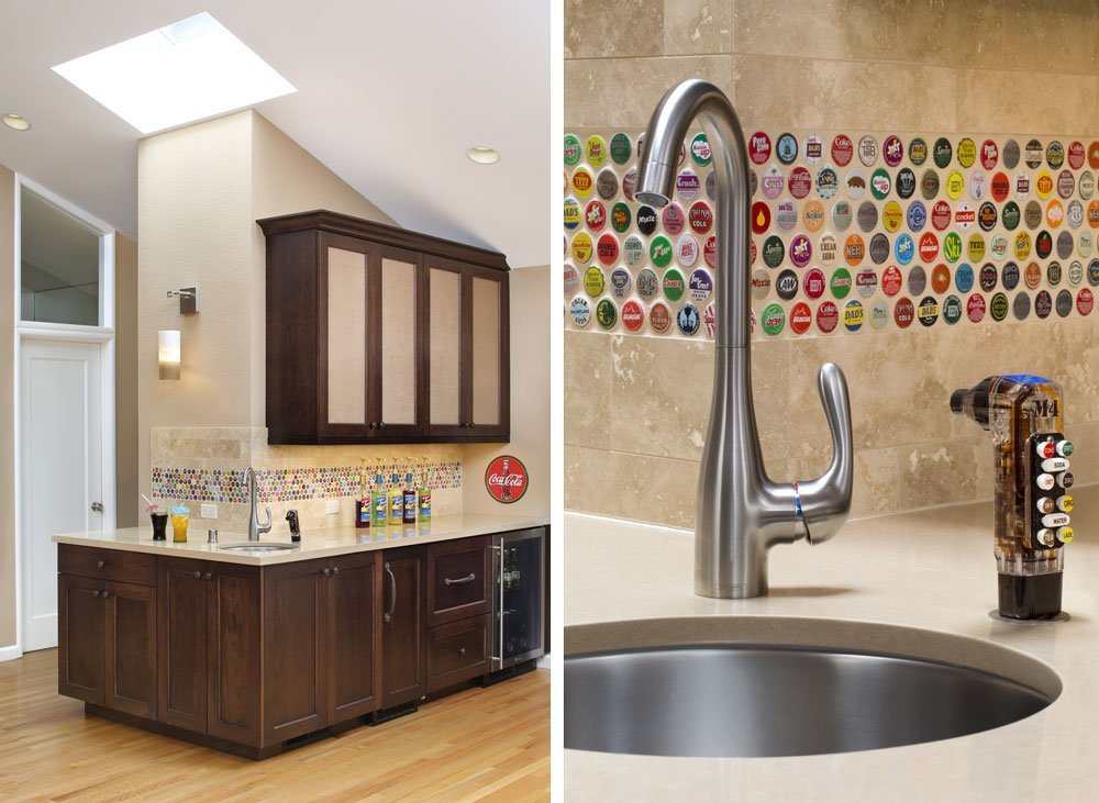
This clever kitchen redesign melded the clients’ passions to create a nearby entertainment space for guests while also allowing the homeowners to simultaneously work in the kitchen and interact with their guests.
Creating A Kitchen and Bathroom Design To Reflect A Family’s “Joie de Vivre”
Sometimes a client just wants to forego all traditional design concepts, and allow Harrell Design + Build and its amazing designers to create something truly fresh and new. This was the case with a Bay Area family who wanted their home to reflect their passion for travel and desire to welcome nature into their children’s bathroom.
Once again, Gloria stepped into the picture, transforming the family’s kitchen and bathroom. Highlights of these design projects include:
Customized Kitchen Magnetic World Map For Displaying Travel Tokens
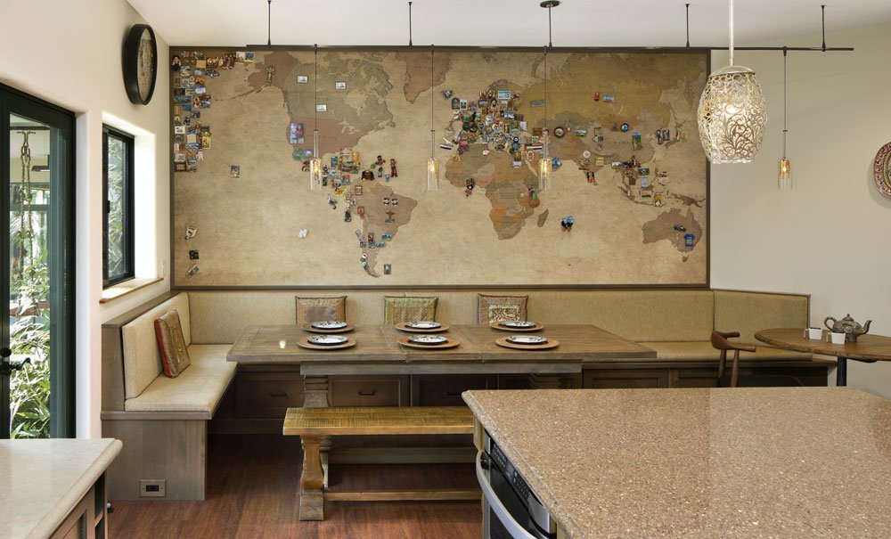
This family traveled the world, collecting magnets from each place they’d visited as tokens of their adventures. Gloria noticed they mounted their collection of magnets on a large whiteboard attached to a kitchen wall. She replaced this bland whiteboard with customized world map wallpaper, with colors to match the kitchen palette, which was adhered to a steel plate to make the map magnetic. The new design allowed the family to place their magnets on the specific countries and cities, while creating a showcase piece that sparked conversation during dinner parties.
The family also wanted a bathroom with a jungle theme for their elementary school aged daughters. For this part of the project, Gloria invited the children to participate in the design and material selections, and they created:
Colorful Children’s Bathroom With Tropical Jungle Theme
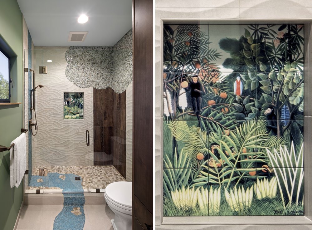
A unique combination of tiles was applied to the bathroom walls to give the space a jungle vibe. A niche in the shower showcased a tile mural with a family of monkeys hiding in a rainforest. Beneath the showerhead, Gloria designed a glass mosaic blue tile waterfall that flowed down the wall, across the shower pan, and onto the bathroom floor to create meandering river. The blue tile river stops in front of the vanity in the shape of a small puddle of water.
Gloria used porcelain tiles with a wood grain to create a large tree trunk design on the shower wall and a leafy mosaic tile and green grout to create the foliage.
The results for this home were spectacular, playful, and completely customized for the client’s lifestyle and personalities.
When it comes to your residence, infusing a remodel with a touch of individuality can be a wonderful way to make your mark on a space. Whatever your passions, hobbies, or visions for your Bay Area and Silicon Valley home, the award-winning designers at Harrell Design + Build Design + Build can help you “take a walk on the wild side.”
We invite you to contact us for a complimentary consultation to discover how Harrell Design + Build can design your next distinctive space.
The Future of Kitchen and Bathroom Remodeling Trends
/in Remodeling, Kitchen, Bathroom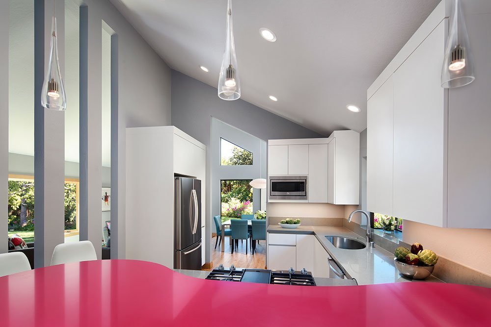 Most homeowners are intrigued to know the hottest kitchen and bathroom design trends and what materials are currently being used in ultra-modern homes. And when they are ready to remodel their own residence, homeowners want to ensure the firm they choose for their remodel project is intimately aware of the latest trends, materials, and design.
That’s why Harrell Design + Build makes it a point to send at least one of their designers to the annual Kitchen & Bath Industry Show (KBIS) to observe and track emerging trends. KBIS is the world’s largest kitchen and bathroom tradeshow where cutting edge designs and trending themes can be experienced firsthand. This year, the company sent two of its designers to perform reconnaissance on behalf of Bay Area homeowners. The two returned with an amazing list of noteworthy styles that will be evolving in the next year or two.
This year, Harrell Design + Build senior designers Sara Jorgensen and Debra Winston attended the KBIS show, returning with valuable insights into current and leading trends for their clients.
“The KBIS is such a huge show. We walked 21 miles and took 21,000 photos. The experience inspired us and we were able to identify design trends and techniques that will absolutely translate to more amazing Harrell Design + Build results for our clients. These trends are happening now, but will also be emerging in the future,” said Sara.
In general, Sara explained that there was a clear distinction between East Coast design trends and West Coast design trends.
“East Coast styles are still very traditional. They are using lots of detailing, and decorative cabinets. But when you see the West Coast styles, they are all frameless cabinets with clean lines and very contemporary,” said Sara.
EMERGING RESIDENTIAL TRENDS
Here are some trend highlights from the show that are relevant to Silicon Valley homeowners:
- Walnut cabinets
Everywhere Sara and Debra went, they saw walnut finishes dominating kitchen and bathroom cabinets. This rich walnut finish is replacing the white-on-white look that’s been popular for traditional kitchens and baths. Walnut is not relegated to just the exterior of the cabinetry but is also being used on the inside of cabinets. Sara and Debra observed that many modern designers are skillfully combining the color white with walnut in a variety of ways to showcase the trend. - LED lighting modules
The use of sleek, under-cabinet, energy-efficient LED lighting was clearly an emerging trend. Manufacturers are developing thin lighting tape that can be used throughout both the bathroom and kitchen. The use of lighting was everywhere, but most prevalent in the skillful illumination of the undersides of counters and cabinets. In many cases, this sleek under-counter lighting highlighted the walnut and white finish on upper cabinets. - Incorporating textures
There’s no getting around it, textured surfaces will be a major influence for residential designers in the near future. Texture is a fantastic option for homeowners wanting to add something different to their kitchens and baths. The use of texture was found in multiple materials including tile, plastic, and even metal. For example, the two took note of engraved textured metal wall panels, walls that looked like rustic wood, and surfaced tile used for highlighting kitchen backsplashes. Sara and Debra discovered that, “texture is here to stay!” - Gold accents dominated
Both designers discovered that gold is being extensively throughout many of the kitchen and bathroom designs they toured. Gold is used sparingly to accent beautiful walnut or other wood finishes. It is also elegantly paired with navy blue. This trend of navy blue and gold was used frequently in kitchen islands or perimeter cabinets, where small gold lighting or cabinet fixtures accentuated the rich blue. - Bold, playful colors
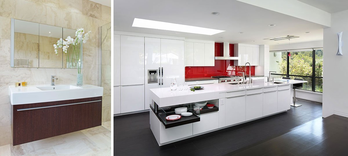
The use of bright reds, blues, and yellows were prevalent throughout the show. For example, many appliances are now sporting bold colors to add some spark to the kitchen. Daring colors are being combined with textured metal in apron-front sinks. Another unique manner in which color was incorporated was by painting the insides of cabinet drawers with bubble gum pink or other playful hues. - Televisions and fireplaces
One of the most visible themes Sara and Debra noted was a focus on televisions above fireplaces. As the designers explored this theme further, they realized that fireplaces are now being manufactured in such a way that they can be paired closely with a large, suspended television. Many high-tech fireplaces incorporated LED lighting trim around their perimeter with the lights changing color to coordinate with a favorite sporting team or to set a mood. Also, there were clever ways of concealing the television behind a large piece of art when not in use. The TV was secured to hardware allowing it to swing down, under the artwork and in front of the fire for easy viewing.
While not every homeowner will use all of these ideas and concepts in their remodeling project, they do provide a great framework for future design ideas. In addition, the concepts have been instilled into the deep arsenal of talented designers at Harrell Design + Build, who are always looking for the next great design solution!
“Design Trends” as Part of Harrell Design + Build Workshop Series
Because the KBIS show was so immense, Harrell Design + Build has incorporated some of Sara’s and Debra’s notes into a “Hot Trends in Products, Design and Remodeling” seminar that are part of the firm’s regular informational series of workshops and presentations for the Bay Area homeowners.
With locations in Palo Alto and Los Gatos Harrell Design + Build has been designing and remodeling distinctive homes since 1985. We invite you to stop by our “Jewel Box” Showroom, attend one of our workshops, or schedule a complementary appointment to learn how we can make your remodeling vision come true.
Design Details: Bathroom Spa Trends
/in Remodeling, BathroomDo you envision slipping into a deep tub, or even stepping into a relaxing hot shower after a long and perhaps stressful day at work? Designing your bathroom to fit your lifestyle will give you the oasis you seek.
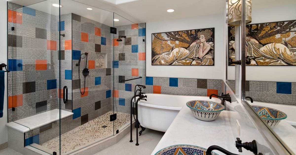
In a fairly short amount of time, the bathroom has gone from “utilitarian” to a space that is a relaxing respite. Bathrooms have evolved into a place to unwind or decompress after a long day, and/or a place to invigorate your morning routine, as you set off for the day ahead.
For some of us “oasis” might mean a walk-in curbless shower, a deep soaking tub or perhaps an infrared sauna. Many infrared saunas also come with Bluetooth capability, allowing you to stream your favorite Pandora station or iTunes. With proper planning and design, each of these can add a touch of luxury to your bathroom remodel and soon, to your morning or evening routine.
We all have a similar desire for the bathroom – a purely functional place at times; and a place to relax, decompress and simply get away from life’s hectic pace. All you need now is a fluffy robe and a candle or two.
Three Style and Design Trends
/in Remodeling, Kitchen, Bathroom, Universal Design + Remodeling, Outdoor Living DesignThree trends, styles and designs that are on the forefront of our designing minds these days…
1. Designed for Aging
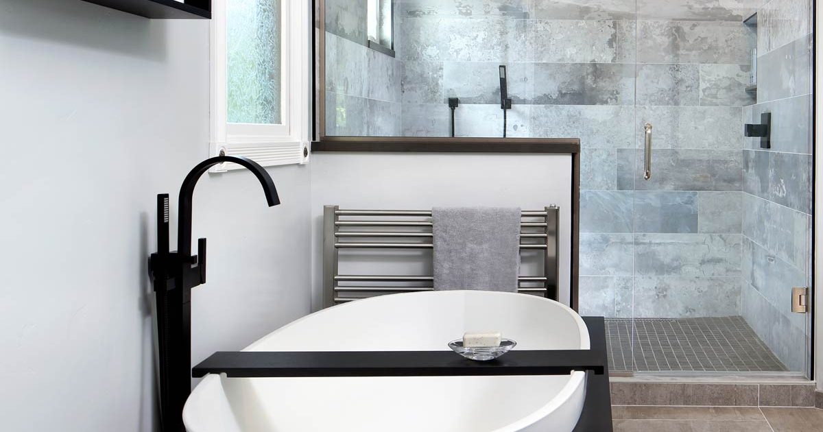
Many Designers are becoming certified aging-in-place specialists (CAPS), in response to the growing need to identify ways to help aging baby boomers “age gracefully” in their homes, for as long as possible. Universal design is one such trend that is coming to the forefront of main stream design for homes. Look for easy kitchen and bath upgrades to enhance functionality, comfort and safety. Features such as wide hallways, enlarged and zero-step walk-in showers, wall hung vanities and lowered countertops blend seamlessly into the design so that the home does not have a clinical or institutional appearance. (zero-step shower and wall hung vanity are shown to the left)
2. California is All About Outdoor Living
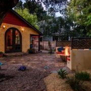
Outdoor living is here to stay. The yard and garden become a part of the floor plan when sliding glass doors or retractable glass walls such as nana-walls™, open up the home and lead to patios and decks, either covered or open to allow for natural light. Outdoor rooms may even include kitchens with sophisticated sinks and grills, including features such as built-in fireplaces, eco-friendly fire pits that burn clean fuel (ethanol) , LED lighting in a variety of colors including water-proof rope lighting discreetly hidden along fences, pathways or decking.
3. Glass Backsplashes
Be on the lookout for back-painted, solid glass panel backsplashes in contemporary settings, which provide a colorful yet ultra-clean, sleek alternative to the more traditional tile backsplash. This sleek look can also compliment a kitchen or bathroom that has busy patterns in the cabinets, flooring or countertops. Glass will provide a simple backsplash will not compete with the surrounding textures, and add either a pop of color or neutrality to your space. (mustard glass backsplash in the photo to the left)
Article Credits: Ciro Giammona – President and General Contractor
Take a Peek Into Our Shower… Options!
/in Remodeling, BathroomWhen it comes to your bathroom remodel, designing a comfortable, functional yet beautiful and maybe even creative shower is probably at or near the top of your priority list. It’s one of the first things we do in the morning, and for some a necessary part of the ritual of waking up and facing the day. Choosing just the right materials, textures, colors, shower door and framing options can be one of the fun aspects of planning this part of your bathroom remodeling design for your unique San Francisco Bay Area home.
Sliding Door
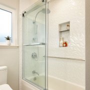
One advantage to a sliding door is that it can move aside on rails or into a hidden wall pocket. For smaller bathroom spaces, a pocket that hides the door in a wall maximizes functional space and can be a sleek alternative in smaller bathroom.
Hinged Door
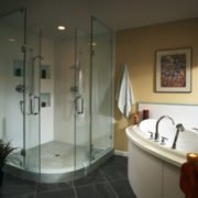
A hinged door creates a more solid and defined enclosure. Metal or stone structures offer a more defined space. Hinged doors swing into the shower or out into the rest of the bathroom space, so be sure that there is ample room between the shower and the adjoining elements – you don’t want to open your shower door into your toilet or bidet. Hinges can be attached to a wall or to a frame. Choose waterproof materials that are rust-free and low maintenance / easy to clean.
Frameless
A shower without a frame opens up and gives the illusion of space, thus making a small to medium size bathroom feel larger. It can also highlight any accents you have in the shower, such as mosaics, listellos and other tiling patterns. A custom designed tile pattern, whether simple or complex, can create just the right feel and enhance your bathroom and ensure it stands out among the hundreds of other beautiful bathrooms you may have seen throughout our San Francisco Bay Area.
Glass Types
There are several options in glass types for glass shower enclosures:
- Frosted glass is a popular option for those who want added privacy. While this takes away from the open and spacious effect that comes with clear glass, it has the added effect of seclusion when you’re inside.
- Cast or patterned glass is beautiful to look at, but may reduce the amount of light from inside the shower, but is an innovative privacy alternative to frosted glass. And with the advent of water-proof LED lighting, and specialty ligthing you can create a colorful or monochromatic lighting plan that can soothe or energize your shower experience while providing a solution to the lack of natural light.
- Traditional tempered glass has a slightly green tint from its iron properties – this glass embraces a contemporary style/design or offers an opposing cool feeling to an otherwise warm-toned bathroom. It can also lend itself to spa-like feel, and with the addition of some cucumber scented water, you may never wish to leave.
- Clear glass (low-iron glass) is a popular choice for people who prefer a clear glass without the slight green tint. This is especially desirable for white or light motifs, or where there is a significant amount of color already in the bathroom, where the preference for the shower enclosure is that is fades quietly into the background.
For more information about choosing the right shower enclosures for your bathroom remodeling project in the San Francisco Bay Area, we would welcome you to give us a call, and speak with one of our knowledgeable design + build employee owners.
Flooring Choices and Where to Use Them
/in Remodeling, Kitchen, Bathroom, Whole HouseWhen it comes to Bay Area home remodels, flooring options can affect the look, feel and sound of any room in the home. Some types are more environmentally-friendly than others. While flooring choices are nearly endless, here are four popular choices in Bay Area remodeling.
Marmoleum
Marmoleum is a type of linoleum made by Forbo Flooring Systems. Its roots are in the phrase “marbleized linoleum.” Marmoleum is anti-static, anti-microbial, is easy to keep dust-free and is ideal for people with allergies. It’s a solid choice for kitchens and bathrooms because of its naturally clean features and lasts between 25 and 40 years. Vibrant color and pattern choices are diverse, separating it from its stereotypical ancestry of linoleum. This green material is not based in petroleum, but in linseed oil. It is one of the greenest flooring materials on the market today.
Amtico
Vinyl flooring has long been a popular choice in flooring for any room in the house. From kitchens to living rooms to hallways to bedrooms, Amtico flooring is a popular choice for remodeling projects. Manufactured by a British company, this is a higher line vinyl floor known for use with accents, designs and patterns. It discolors with high heat, and protective floor guards will keep it from getting scratched by furniture. An Amtico floor dressing will provide added protection from scuffs, spills and scratches.
Cork
Cork flooring is a sustainable material that comes in as many as 40 different shades of color and a variety of patterns. It is comfortable to walk on in bare feet and is an excellent choice as a noise barrier. Use it for upstairs floors or for rooms where quiet is appreciated. Although it is insect-resistant and can last for years, it is susceptible to scratches and dents from furniture, sharp objects and high heels. Cork flooring is practical for people with allergies, but fades under constant light and warps with high humidity. Use it in any room in the house except the bathroom and laundry room.
Hardwoods
Hardwood floors are durable, ranging in color from blond to black. Exotic and domestic woods offer high-quality. They blend well with any decor and will last for years when sealed. Medium shades show less dirt than dark or light hardwoods, and placing mats by high traffic exterior doors is wise. Hardwood flooring lasts more than 100 years and can be refinished or repurposed to extend its life. Hardwood floors are good for people with allergies and are easy to keep clean.
NEWSLETTER SIGN UP
HarrellCARE
2284 Old Middlefield Way
Mountain View, CA 94043
650.230.2900
408.884.8564
